
Local Shelf
Designing an end-to-end iOS application for buying and selling used books.


Background
Buying new books can be an expensive hobby, and although thrift stores provide a cheaper alternative, their selection is random and depends on what has been recently donated. Beyond casual readers, there are college students to consider. Students need to find required textbooks for classes but are often limited to the area near campus. But what if there was a product that allowed users to buy and sell books in their area?

The Product Concept
Because my idea for Local Shelf consisted of two angles– buying/selling locally and buying/selling books specifically– I decided to conduct research with two goals in mind:
1. Learning about users’ experiences using local buy/sell products
2. Learning about their experiences purchasing secondhand books
I had an idea of what a book-selling product similar to Facebook Marketplace might look like. By learning more about other products and their essential features, I wanted to develop a clearer picture.

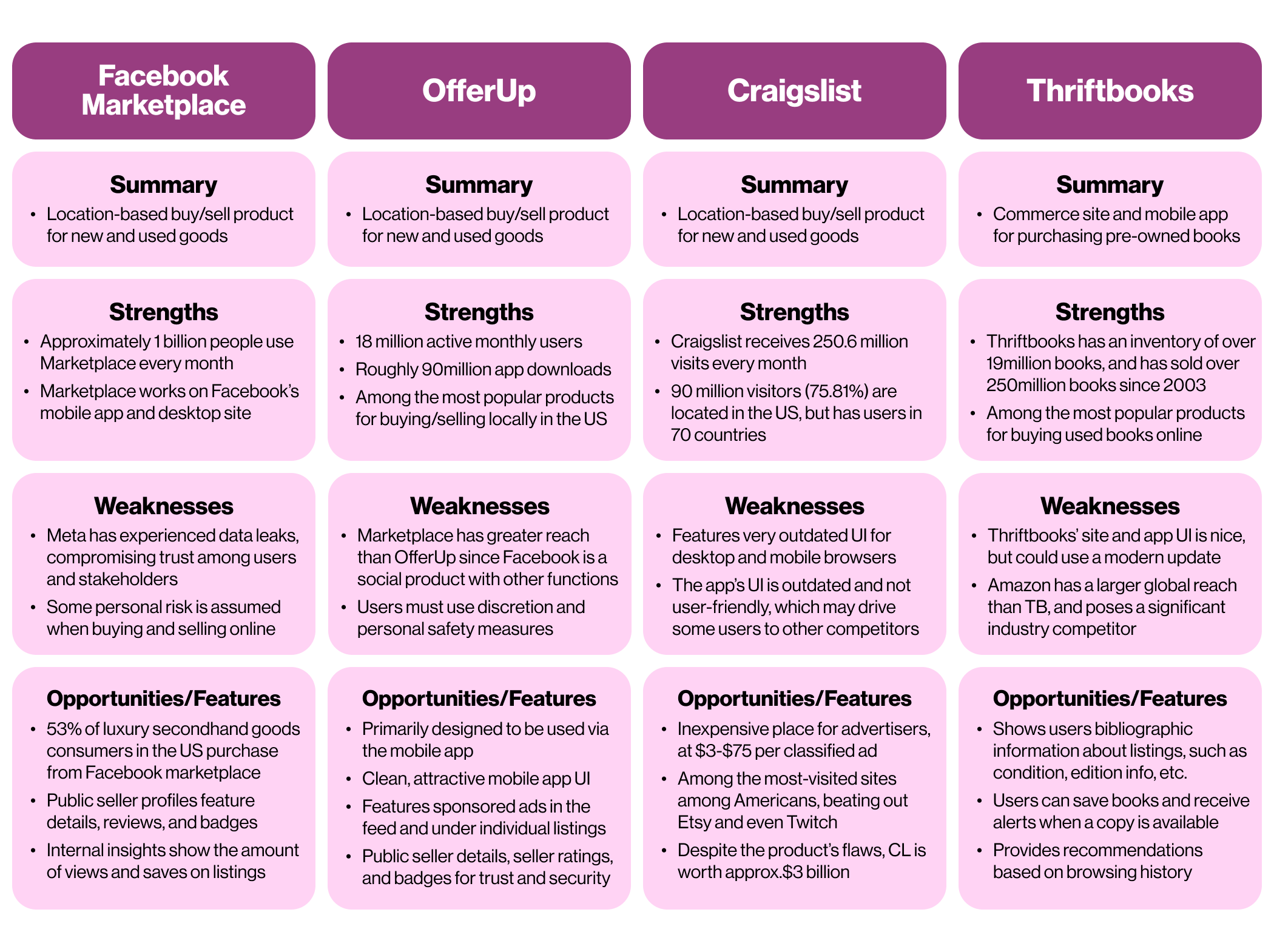
Analyzing the Market
Because the product's primary function would be buying and selling goods locally, I analyzed the strongest competitors in the local commerce space—Facebook Marketplace, Craigslist, OfferUp, and Nextdoor—to discover their strengths, weaknesses, and the features that make these products work. Thriftbooks specializes in reselling used books, making it essential for determining the necessary bibliographic information for a product like Local Shelf.
User Interviews
To tackle both of my research objectives simultaneously, I recruited four participants who had used local buy/sell products. I also asked additional questions about an experience many people have encountered—buying, selling, and trading used textbooks for college. All participants were college graduates who had bought or sold textbooks to other students or purchased secondhand through their campus bookstore or Amazon.

Affinity Mapping
After the interviews, I grouped any mentions of beneficial features and users’ habits. All participants mentioned concerns with scammers when using local buy/sell products, but appreciated products that allowed them to check other users’ reviews before making a transaction. I quickly discovered the most frequently mentioned feature was searching by location and expanding the search radius. Clearly, the local buying/selling aspect of these products is their biggest draw.

Interviewees reported using a few different methods of buying and reselling used textbooks. The most common ways students bought and sold books were through online booksellers, selling among their peers, and buying or renting through their campus bookstore. Despite the convenience of Amazon and the physical proximity of the campus bookstore, participants felt that these options were still fairly expensive.

Empathy Mapping
Next, I generated an empathy map to understand what users think, feel, and respond to. Participants’ frequently mentioned the following priorities:
Saving money by buying used goods
Earning money by reselling their used goods
Feeling safe during transactions
Finding items listed in their area
By my reasoning, a location-based product for buying and selling books would benefit both students who are limited to a single area and users who are willing to travel for the books they need. Unlike books people buy for casual reading, textbooks are a necessity, which increases the demand for a way to find the best price.

User & Business Goals
The next step was to define the user and business goals to better understand what this product will accomplish for both the everyday user and the product owner. The user goals for a product like this are searching for books within a specific area, purchasing an item, and posting books to sell. No matter the task, users also need to feel secure knowing the app will provide the tools to vet other users before initiating a transaction.

Who Are the Users?
Next, I developed two personas to cover the needs of Local Shelf’s two most likely users– the student and the bookworm.
The student, Artie, represents college students, Local Shelf’s primary user. Because of his academic commitments, he can’t travel far outside of campus to purchase textbooks, so he wants to browse books nearby and save money.

Caleigh, our bookworm, is an avid reader and book collector. As a young professional, she’s more likely to have the means to search and travel outside her immediate area to find the books she’s looking for. Because she’s not a student, she has a bit more money to splurge on her reading hobby.

Feature Set
After determining the user, I prioritized the most important tasks and screens. I selected three flows that address the users’ primary tasks:
Adjusting the proximity of the listings in their feed
Purchasing a book listing
Posting a new book listing for sale
Although I wish I could accomplish everything, any tasks and features that fall beyond the scope of this project will have to become “Next steps” for later.

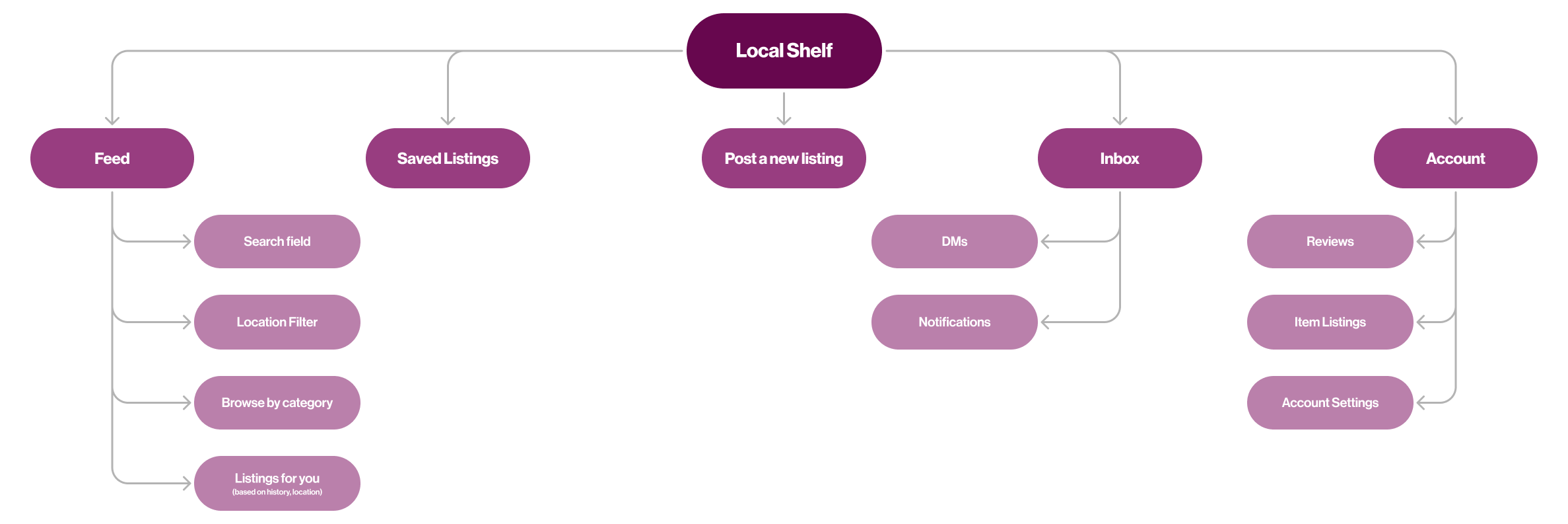
Local Shelf Sitemap
Secondhand-selling products like OfferUp, Depop, Mercari, and other similar apps feature a navigation bar at the bottom of the screen. Local Shelf required a home feed for viewing and searching for nearby book listings, a page to view saved listings, a “new post” icon, an inbox for DMs and important notifications, and the user’s account and profile.
User Flows
The next step was to flesh out and develop the three user flows from earlier:
Adjusting the location radius
Purchasing a book
Posting a new book listing.
These flows included vital screens like the new listing form, which should contain all necessary fields for a book listing without requiring too much effort to fill out, all necessary transaction screens, and any alternate or exit paths a user may take. And finally, here comes the fun part— designing the screens!

From Sketches to Wireframes
While sketching the home feed, I took a lot of inspiration from OfferUp and Facebook Marketplace. OfferUp features a prominent sticky banner at the top of the screen where users can adjust the location radius of listings in their feed, which is very visible to the user. A drawer with a location slider allows users to adjust the home feed without making them feel like they’re leaving the screen.
Users would benefit from having a way to conduct secure, documented transactions through the app during the in-person exchange besides cash alone. Finally, I needed to design a “new listing” form that encourages users to supply the necessary bibliographic information without making them feel overburdened. Most users don’t want to spend a long time filling out a form, so I chose to require only the “title,” “author/publisher,” “price,” “condition,” and “location” fields, leaving the “edition” and “publication year” fields optional.
Does it Work?
Finally, it was time to test this prototype with book lovers and secondhand shoppers! I recruited five participants for moderated usability testing via Google Meet, Discord, and in person. They were asked to describe their thought process while navigating through the three flows as I transcribed, noting any areas where they stumbled.
Although users’ feedback was overwhelmingly positive throughout the testing process, they encountered a few problem areas when testing the “purchasing” flow and a few minor hierarchical issues.

Revisions
After presenting users with an A/B test, the consensus was that the vertical central alignment provided a clearer visual hierarchy. Because of this, I decided to revert to one of the layouts from my low-fidelity sketches and make the listing cards taller so the product thumbnails were easier to view at a glance.

Early participants mentioned that clearer language in the tooltip on the secure payment screen would have made their purchase process much easier. I edited the copy to provide more information about the process and a link to technical support, and later participants found it much easier to complete the task.

Users mentioned that although the tooltip on the payment screen provided helpful information, they would have also preferred to see this information was conveyed earlier in the flow. To solve this, I added an additional tooltip to the DM screen to clarify the purchase process. I also changed the weight of the “Make an Offer” CTA to improve the visual hierarchy.

Check Out The Final Product!
Nice to finally see my designs in color! By the end of this project, I designed a total of fifteen screens and a Figma prototype for the three primary task flows, as well as an additional flow that allows the user to explore each screen I’ve designed… so far, anyway. You can view these screens in action here below!

High-Fidelity Wireframes

UI Kit & Brand Identity
Local Shelf’s primary palette consists of a warm purple primary color and a complementary shade of gold. The jewel-toned color palette feels approachable, warm, and erudite, meant to evoke the feeling of being inside a library. Local Shelf’s brand identity stands out among book-selling competitors like Thriftbooks and Amazon, as well as other local selling products.

Next Steps
I’d like to design a few additional screens to fully flesh-out this product. My main priority will be designing an additional flow for leaving a review immediately after completing a purchase.
For some reason, I just was not feeling very inspired while selecting colors for Local Shelf’s brand identity. Fortunately, my priority for this project was designing a functional product, not aesthetics. Still, it would be fun to experiment with Local Shelf’s brand identity in the future!
